Glen Swart
Category: Creative
02.04.2021
New year, new you. It’s that time of the year again, where we make resolutions and look to be inspired by our surroundings. We look to color and uncover what we can learn from devils wearing Prada.
One of the big influences in our lives is color. Color psychology is constantly at work in our subconscious and based off the design systems integrated in our everyday lives. As well as our own personal experiences with color. From things that are red hot telling you not to touch them to brightly colored objects calling for your attention or offering a warning.
While colour trends come and go —I’m sure we all remember the year International Klein Blue hit the design world, it was everywhere!— color psychology is here to stay. What do we mean by this? Simply put, we have common associations with color, generated by a feeling, an experience, our culture or education. It is very personal. Seemingly simple color choices inform our decision-making daily and help us digest the world around us.
In design, we group color by temperature; warm, cool and neutral tones. Warm colors, for example, include red, orange, and yellow, and variations of those three colors. These are the colors of fire, it’s autumnal, and of sunsets and sunrises, and are generally energizing, passionate and positive.
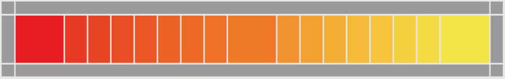
Red and yellow are both primary colors, with orange falling in the middle (making it a secondary color). Using warm colors in our designs may reflect a sense of enthusiasm, passion, happiness and energy. These colours may seem similar, but they have strongly contrasting meanings and emotional triggers.
Let’s have a look at the opposite ends of the warm spectrum. Red is a very hot color. It is often associated with love and passion. However it also draws up imagery of fire, violence, instability and warfare. You’d be spotting this in both Cupid & The Devil’s wardrobe. Vivid reds are proven to actually have a physical effect on people, raising blood pressure and respiration rates.
The tint or shade of red we select can therefore depict an emotion in varying degrees. We could employ it to stop someone in their tracks (traffic lights and warning labels) or depict anger (seeing red). On the other hand, we could signify importance (red carpets) or royalty (rich and opulent).
Outside the western world however, red has a very different cultural association. For example, in Soviet states, red was associated with communism. In China, red is the color of prosperity and happiness —thought to be able to attract good luck. It can mark new beginnings in other eastern cultures, where red is often worn by brides on their wedding days. Or the end of a journey, as in South Africa, where red is the color of mourning with roots in Apartheid and the bloodshed of this time. It is also seen in AIDS awareness campaigns, perhaps as a symbol of compassion or loss.
It can have an overwhelming effect if it’s used too much in designs, especially in its purest form. Red can be very versatile, though, with brighter versions being more energetic and darker shades being more powerful and elegant.
On the opposite end of the warm spectrum we find Yellow. It is often considered the brightest and most energizing of the warm colors. We associate it with happiness and sunshine. Exactly what we need after 2020!
Yellow is also associated with hope, as can be seen in some countries when yellow ribbons are displayed by families who have loved ones at war. As with red, it is also associated with deceit and cowardice. The brighter range is also associated with danger or warnings. In some countries, yellow has very different connotations. In Egypt, for example, yellow is for mourning. In Japan, it represents courage and in India it’s a color for merchants.
In our designs, bright yellow can therefore lend a sense of happiness and cheerfulness. Softer yellows provide a gender-neutral color for babies (rather than blue or pink). Light yellows also give a more calm feeling of happiness than bright yellows. Dark yellows and gold-hued yellows can sometimes look antique and be used in designs where a sense of permanence is desired.
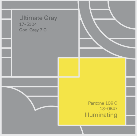
As a creative agency, color proves an important tool in our toolbox. So it is exciting news when a major player announces their ‘color of the year’, or to be precise, they have announced two this year! We can safely predict you’ll be seeing Ultimate Gray and Illuminating by Pantone in large amounts this year.
This is a great little video from GCF Learn Free that covers all the basics if you’d like to learn a little bit more about color and why it’s so useful and used in our design work.
Still not convinced?, as someone —albeit fictional— once said…
“But what you don’t know is that that sweater is not just blue, it’s not turquoise. It’s not lapis. It’s actually cerulean. And you’re also blithely unaware of the fact that in 2002, Oscar de la Renta did a collection of cerulean gowns. And then i think it was Yves Saint Laurent – wasn’t it, who showed cerulean military jackets? And then cerulean quickly showed up in the collections of eight different designers. And then it, uh, filtered down through the department stores and then trickled on down into some tragic Casual Corner where you, no doubt, fished it out of some clearance bin. However, that blue represents millions of dollars and countless jobs”
Miranda Priestly
The Devil Wears Prada (2006)