Ida Rosenthal
Category: Strategy
10.08.2013
Excel spreadsheets are powerful tools for organizing data, but let’s be honest, sometimes even the most well-intentioned spreadsheet can make an interesting topic seem dull. For example, if you’re looking for a good place to grab lunch after visiting NJI Media headquarters, this spreadsheet isn’t going to help you much:
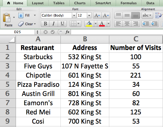
Sure, all the data is there, but it’s difficult to see which restaurants are popular or how far those places are from NJI’s office.
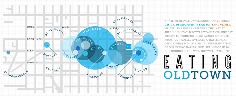
Instead, our graphic designers made a beautiful data visualization that shows the same data in a much more meaningful way. Need to grab lunch nearby? Run next door to Subway. Want to try a local favorite? Head to Chipotle.
Formally, data visualizations are defined as the visual display of information. In practice, they help people understand spreadsheets and databases more effectively. Visualizations show patterns quickly and enable people to ask, “Do you see THAT?”
In other words, data visualization transforms a table full of statistics and turns it into information that clients can actually use. Whether it’s an infographic, a map, or a chart (to name a few types of visualizations), clients want to see data come off the page. A spreadsheet simply won’t cut it.
If you want to see more awesome data visualizations, check out the truth about D.C. food trucks and why America should maintain regular trade relations with Russia.