WASHINGTON GROWN/ELEVATED IN DC
Establish a unique voice within a saturated marketplace
The boom of the cannabis industry has created a saturated market, allowing suppliers and customers to be that much more discerning about the products they purchase. This landscape makes it essential to not only supply a high-quality product, but to supplement it with a compelling story and effective branding.
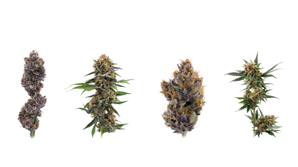
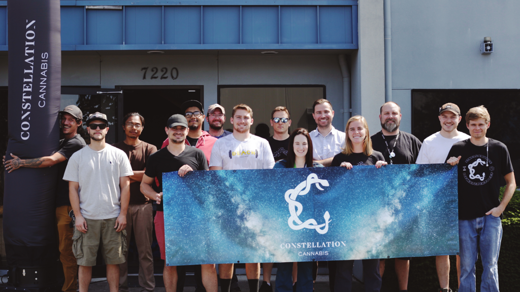
As a female-owned, family-operated producer, Constellation is already well-known for its medical-grade quality products and innovative strains. Yet it lacked a website that communicated that unique value to current and potential customers.
OUR APPROACH
Refined style and top-notch functionality tell the right story
Clean
Modern
Sophisticated
PROJECT BRIEF
Constellation Cannabis, a grower based in Washington State, reached out to us to revamp its website and achieve two key goals:
1. Elevate design and UX to better mirror the caliber of Constellation’s product
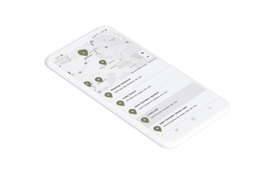
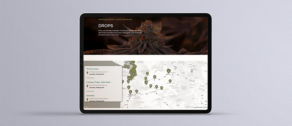
2. Develop a functional “drop” map, giving customers a user-friendly snapshot of where product has recently been restocked
The Process
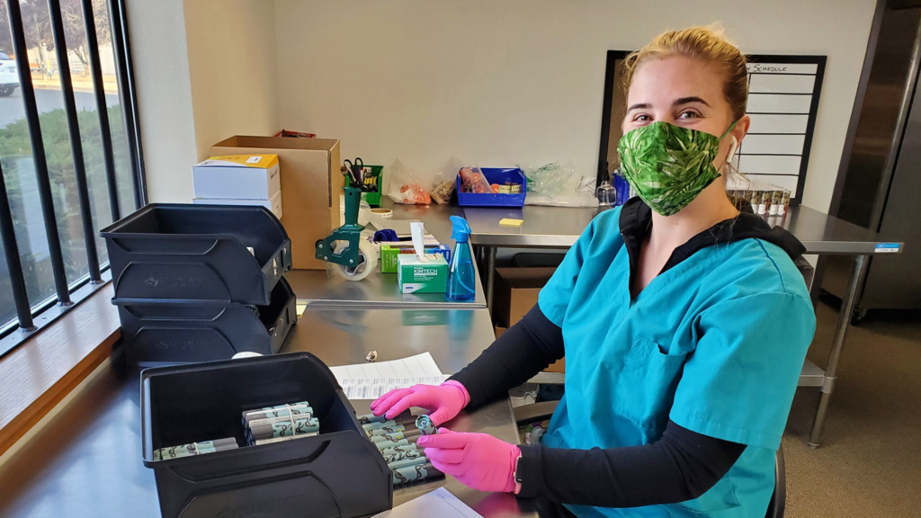
A key requirement for current and potential customers is the ability to see where product has been recently restocked or “dropped” near them. This popular marketing style derives from the sneaker and limited-edition apparel market, where high demand and low quantity are the norm.
Our team reimagined Constellation’s drop list as an interactive map that lets users quickly pinpoint nearby sellers, see when they last received a drop, and click-through to view the products and strains sellers carry. Every week, an average of 15 new drops occur, so Constellation needs to be able update the map quickly.
Our developers created a two-step process supported by a straightforward back-end experience, so the team can quickly add new stores, products, and dates and provide real-time updates to customers.
The Outcome
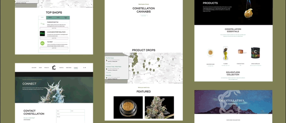
The reinvigorated website is both a place to find products and a resource for connoisseurs and novices seeking to learn about individual strains and healthy growth processes. A reimagined aesthetic was a unique opportunity to communicate Constellation’s quality and culture instantly, before a visitor even begins to explore. A predominantly black and white color palette creates a sleek, clean motif — accented by high-resolution photography, custom iconography, and smartly placed animation.
An updated, user-driven navigation creates clear paths for visitors to quickly identify and access pertinent resources.

At a glance:
drag
2,807
miles between our two headquarters
106
individual retailer pages added
8
new tailored icons
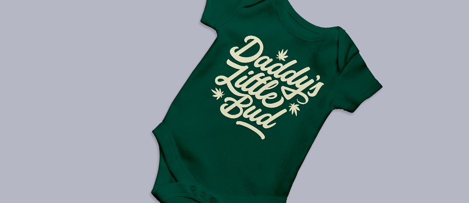
1
custom onesie
4:20
daily check-in
C-SPAN
fortune favors
the bold
We collaborate with tenacious organizations and ambitious people.
╳