PURPOSEFUL CHANGE
redefining a brand with punch
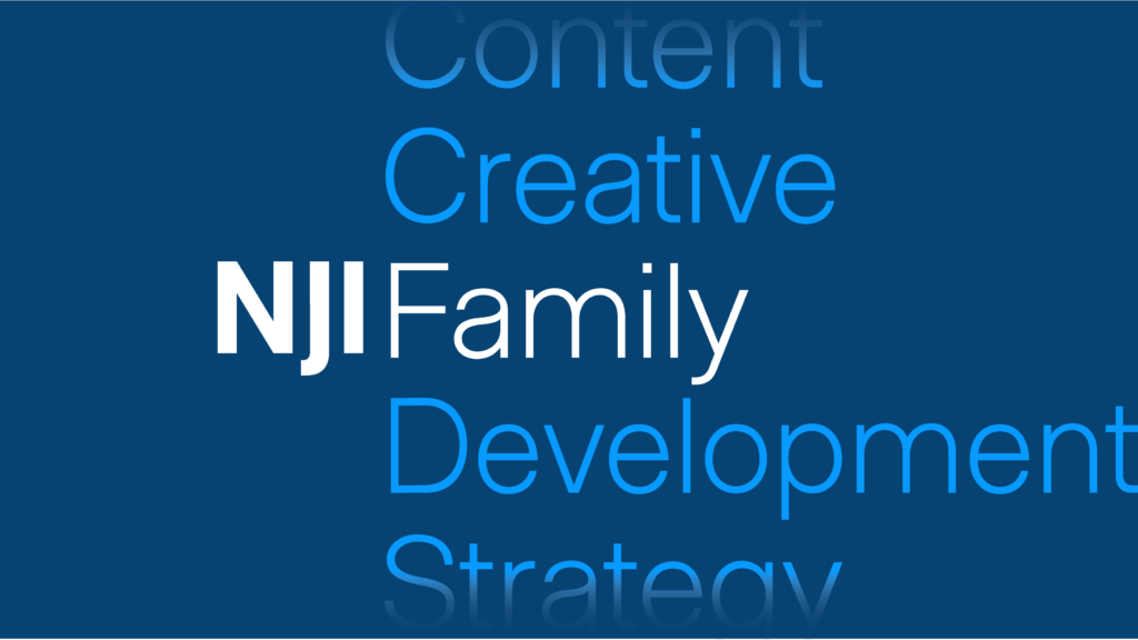
NJI is a creative family with a lust for life. Crafting a brand that captures our joie de vivre requires keeping numerous elements (read: all our feelings) in balance. We took ourselves through the same steps we guide clients through when evaluating and creating brands. In the first, the discovery process, we applied the same rigor of internal and external examination deployed on behalf of clients.
OUR PROCESS
Refine the current brand. This important choice emerged as central to the project. More than selecting a new pantone or tweaking a font, it was a recognition that the foundation of the brand, created more than a decade ago, still has resonance today and will tomorrow.
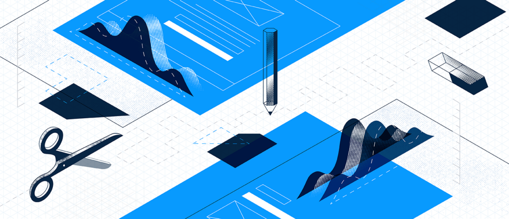
An agency brand needs to be both an expression of its design point-of-view and platform from which client work can be showcased. Expressed extensively in digital, the brand must also have strong elements that succeed in print. Understanding the most impactful brand expression would be a study in opposites, we dove into the moodboard process.
OUR APPROACH
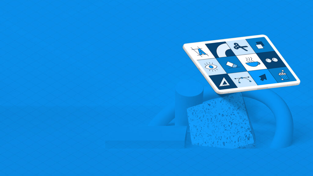
immersive sensory experience
Media agile
Infused with surprise and delight
Defined by its simplicity
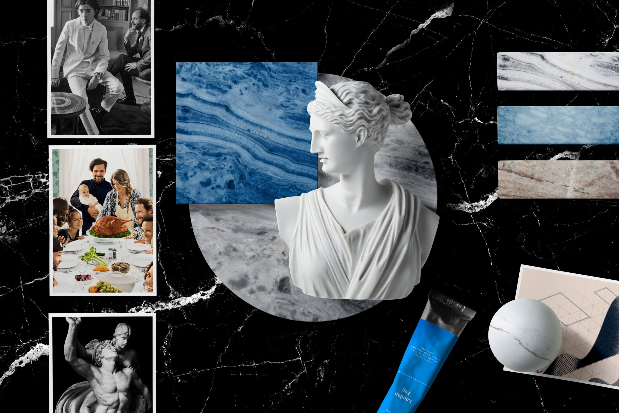
Feeling Moody. Each image, word, and color on a moodboard is selected with care and purpose. The sum is greater than the parts, but each element must represent something essential to understanding the proposed direction for the brand. For NJI this crystalized in a board titled Renaissance.
Here we affirmed the essence of a brand that is elegant and playful-- yet with depth. Through color, typography, and image the team proposed a direction that activated the senses. Each exploration was presented and discussed at length. Ideas examined and refined to influence the design direction.

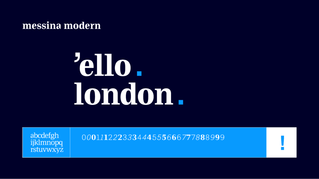
How You Say It. Language emerged as a critical partner in the visual process. A single phrase captured NJI’s unique point-of-view: equal parts punch & wit. Bringing forward the idea of bold, risk-taking balanced with sharp-minded ideas felt just right.
Brands intersect with prospective clients in different ways at different moments. Often, it is the work done on behalf of a current client that sparks an initial conversation. However, for others there is a weighted consideration given to how an agency expresses its own brand and perspective. This was a consideration as we refined the design approach. Would a person who viewed this brand, likely online, get a true sense for who NJI is as an agency?
Media Squared. That outside viewpoint affirmed an internal discussion, we no longer need to say “media” as part of our name.
Early in this century, creative work was still framed as “interactive” or “multimedia” when it included a digital component. Now it is understood. No brand, campaign, or project is undertaken without the medium/media being considered. It is a part of who we are, it is embedded in NJI’s brand the same way the blue square is the everpresent part of our identity. The media didn’t go away, but in our brand expression it didn’t need to be overtly present. The square will express the many media and ideas that make NJI unique.
OUR IMPLEMENTATION
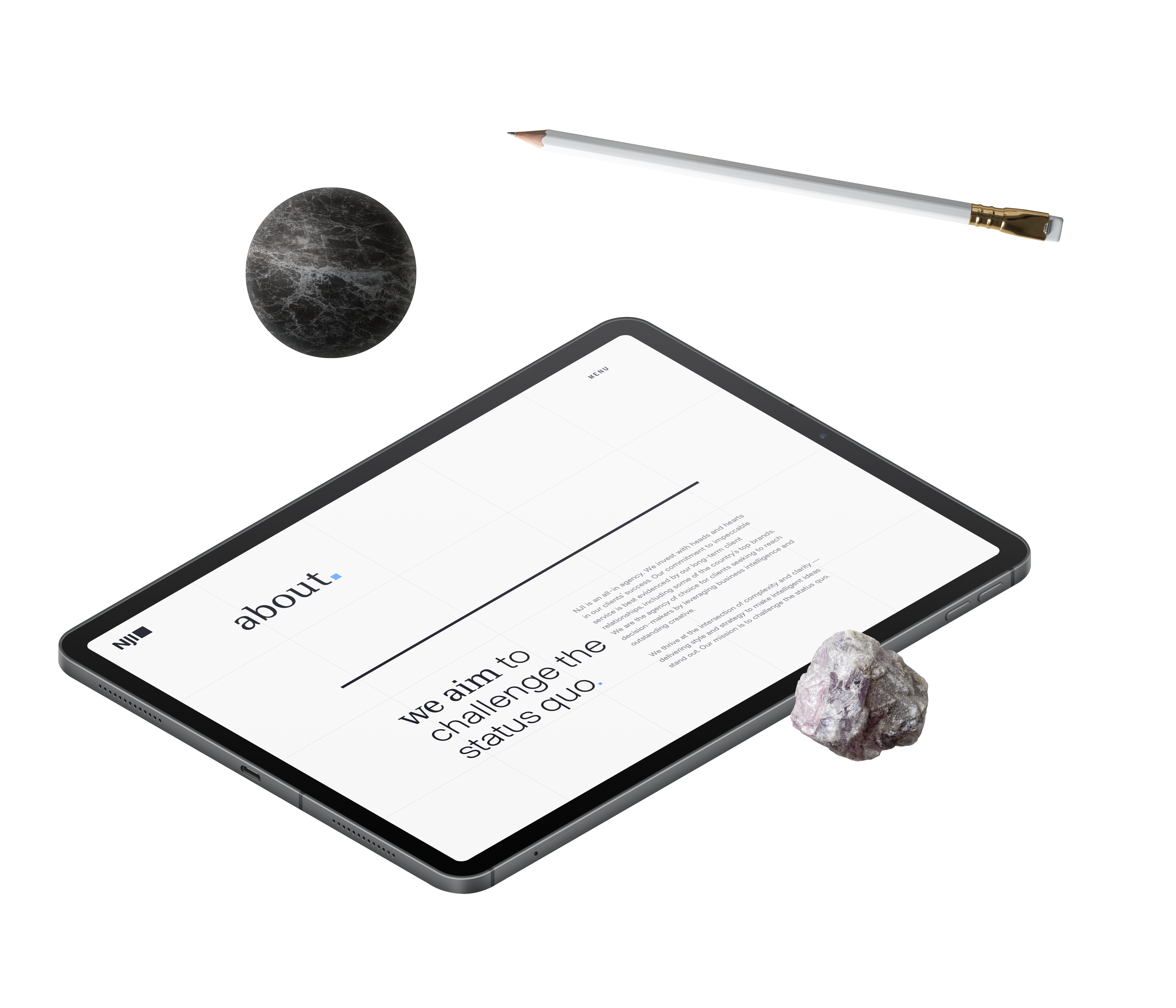
Build with Confidence. The clarity achieved during the discovery process allowed the team to define and design the brand elements and ultimately the new website and related assets with certainty. There was a marrow-deep understanding and energy around the refined brand and how it would manifest online and beyond.
Centered around the user experience as paramount to experiencing the brand, the development of the new njimedia.com began in earnest with designers translating the brand into Adobe Sketch and liaising with collaborators across our strategy, development, and video teams to infuse the right amount of punch in the elements and pages of the site.
Subtle and overt. Creating a site that is easily traversed, yet allowing room to surprise and delight requires a symphonic approach to its creation. Everything must be in sync in order for the site to succeed. When the outcome feels effortless to the end user the right balance has been achieved.
THE RESULT
Room to Grow. Knowing when to stop refining and go ahead and launch is a skill. For the refined NJI brand and website, we recognized that the foundation was ready and while our ambition and ideas are endless, it was time to share. We have more capabilities and opportunities that will be added in the weeks and months ahead, but we are ready.
Ready to continue to grow and evolve as an agency in a world that looks very different from just a few months ago. United as a team that is spread across states, countries, and timezones to continue to support and challenge ourselves and our clients. Inspired to do even more with the next decade that lies ahead.
At a glance:
drag
2007
brand first created
3x
Jon Hamm photo in moodboards
10
weeks to complete
2
opinions that mattered most
1,000+
Slack Messages
2
Drizly Orders
2 weeks
QA Process
Ventec Life Systems & General Motors
fortune favors
the bold
We collaborate with tenacious organizations and ambitious people.
╳