Alex Barton
Category: Creative
10.14.2015
The word “brand” usually brings to mind iconic logos like the Nike Swoosh or Coca-Cola’s flowing script. However, brands are comprised not only of logos, but of the products, environments, and experiences that give them context. An identity this complex requires a multifaceted team of designers, developers, and strategists to make it memorable and successful. Each facet of a brand helps distinguish the company and facilitates consumer trust and loyalty. Spend a little time at NJI and observe an attention to detail that surpasses the abilities of any individual freelancer.
THE EFFECT OF PRODUCT ATTRIBUTES ON BRANDS
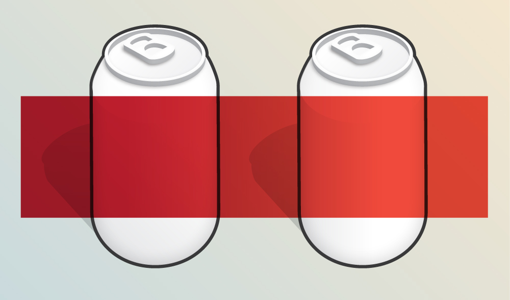
Successful brands are informed by aesthetics of their products and applications. Set down that Pumpkin Spice Latte for a second and picture buying a soda in a logo-less supermarket. All this supermarket sells is food wrapped in colorful plastic. Would finding a Coke be any more difficult? When we compare the red silhouettes of Coke and Dr. Pepper, we can discern a difference: the Dr. P label color has a mixture of more blue and less yellow. Yet, when describing either drink it’s easy to simplify their descriptors to “silver cans with red labels,” especially if the two sodas are not directly next to each. Every color we perceive is relative to its environment. It appears that earlier in Dr. Pepper’s branding history they sported a bright red similar to Coca-Cola’s. The change to a deeper hue possibly reflected the intention to reduce mistaken identity, yet remain eyecatching. They might also have desired a deeper color to signify a richer taste than other sodas. Whatever the intent, color is a basic context that yields significant associations and just one element that we designers take seriously.
As designers, we are trained to think in color, to think about the associations that are produced by simple changes. For everyone else, it’s important to be given a basis for comparison to understand brand relativity. To understand the subjective elements of design, such as a color that is too somber or a typeface that looks too casual, members of our creative team design individually, but critique communally. On a recent branding assignment, I spent a fair amount of time choosing a professional-looking slab-serif typeface, only to find out that it conveyed a playfulness to the other designers. After this, the team directed me to Tisa Pro, a typeface with less contrast (the ratio between thick and thin strokes) and an overall heavier appearance. Upon seeing this typeface next to the old rendition, I instantly agreed: my choice did look too playful.

THE IMPORTANCE OF COMPARISON THROUGH APPLICATIONS
Much of art and design education is based on the compilation of aesthetic references. For every design there are hundreds of inspiration sources, like posters, paintings, and architecture. It’s our job as designers to, at the same time as delivering a product, educate the client on good aesthetics. To do this we create a diverse selection of applications. This is why for a recent branding assignment we not only presented the logo but accompanying mock publications for digital and print contexts. By adding application to the initial designing phase, we address issues such as logo legibility at different sizes, photography complements, and typographic pairing, with enough time for consideration. It is no longer enough for a designer to deliver a logo and a letterhead when products are no longer bound to a tangible plane. At NJI, we create the identity in tandem with its applications to educate our clients and produce strong brand consistency.

THE BRANDED ENVIRONMENT
A good brand is more than an identity: it is a context that is both familiar and new. A brand is not simply a memorable image, as is evident in my recent move to Old Town, Alexandria from Virginia’s capital. Previously, I lived in the Fan district of Richmond, VA, a neighborhood whose identifiers include historic townhouses, lush deciduous trees, and the aroma of the Sauer spice factory. From the inviting atrium of the Virginia Museum of Fine Arts to the decorative bathtub in Strawberry Street Cafe, it’s hard not to buy into the Fan’s medley of historic and modern character. When considering my transition to Old Town, I rationalized location, price, and proximity to community art spaces, but after living here for almost two months, I am realizing just how much my previous neighborhood influenced my decision. I was so effectively sold on the historic setting of Richmond that it did not take the trolley ride from the King Street Metro to the Torpedo Factory for me to appreciate the cobblestoned flavor of Old Town. The Richmond brand had instilled so much trust in me that finding an apartment in Old Town required little adjustment and felt like stumbling upon a secret area of my hometown.
The NJI equivalent of this environmental branding is created by our Development team. Potential clients cultivate their own digital space through sites such as Facebook, Twitter, Youtube, Instagram, Snapchat, Vine, Spotify, Tumblr and personal websites. To make sure our logos have the best possible context, our designers and developers work close to each other (metaphorically and literally close: the developers sit right behind the design team). As opposed to the freelance designer that closes a job when when they submit their designs, our design team can accommodate obstacles that appear during development. A symbiotic relationship exists at each stage of our branding process.

BRANDS ARE INFLUENCED BY EXPERIENCES, NOT JUST FORMAL DESIGN ELEMENTS
A logo symbolizes the identity of a company while the brand represents the interaction with customers. A clear example of this is fast food. Convenience is integral to fast food brands, usually more so than the quality of the food. Much of the McDonalds, Burger King, or Chick-Fil-A brand relies on the standardization of core elements that define the dining experience. When McDonald’s updated their store interiors a few years back to include more neutral colors, exposed wood accents, and clean geometric furniture it appeared as if they were striving to serve something more that soggy burgers dipped in heartburn. Yet, did we feel the urge to tip our server or ask for our burgers ”medium-well?” Did we wait to be seated upon entering the newly veneered environment? Of course not. Why? Because the McDonald’s change was only aesthetic. Painting the interior eggshell did not remove experiences, such as clumsily maneuvering your car in the drive thru, trying to open grease-encrusted ketchup packets, or discovering that you had been wrongfully given a Number 4 instead of the Southwestern McChicken sandwich. These associations ensure that nobody questions whether they are eating at the Ritz or the Golden Arches. It’s true you’d find these experiences at any fast food restaurant, which is all the more reason to add a strong logo and color scheme.
THE VOICE OF YOUR BRAND
To the average viewer, brilliant design may go unnoticed compared to the language of a brand’s content. Complex content needs clear description and a central thought process. That is how NJI’s strategists contribute to our branding dilemmas. Our strategy team defines the content and copy of our designs. They are the filters and motivators of the design and development work, and are present at all stages of the branding process. They make sure that when a customer first loads a website or sees an advertisement on Twitter that they view content that is not the equivalent of cheap burgers, but of a roasted halibut. Infographics and typography can boldly inform copy, but if the copy is not written by a team that recognizes the appropriate audience, communication medium, or delivery, the viewers attention won’t last but a second.
Products, environments, and experiences are integral components of successful brands. While these components are often overlooked in the branding discussion, it is important as designers and consumers that we consider their effects. It is important that we reject the romanticized notion of perfect logos. And it is important that we engage branding beyond our own desks and in the environments of our clients.