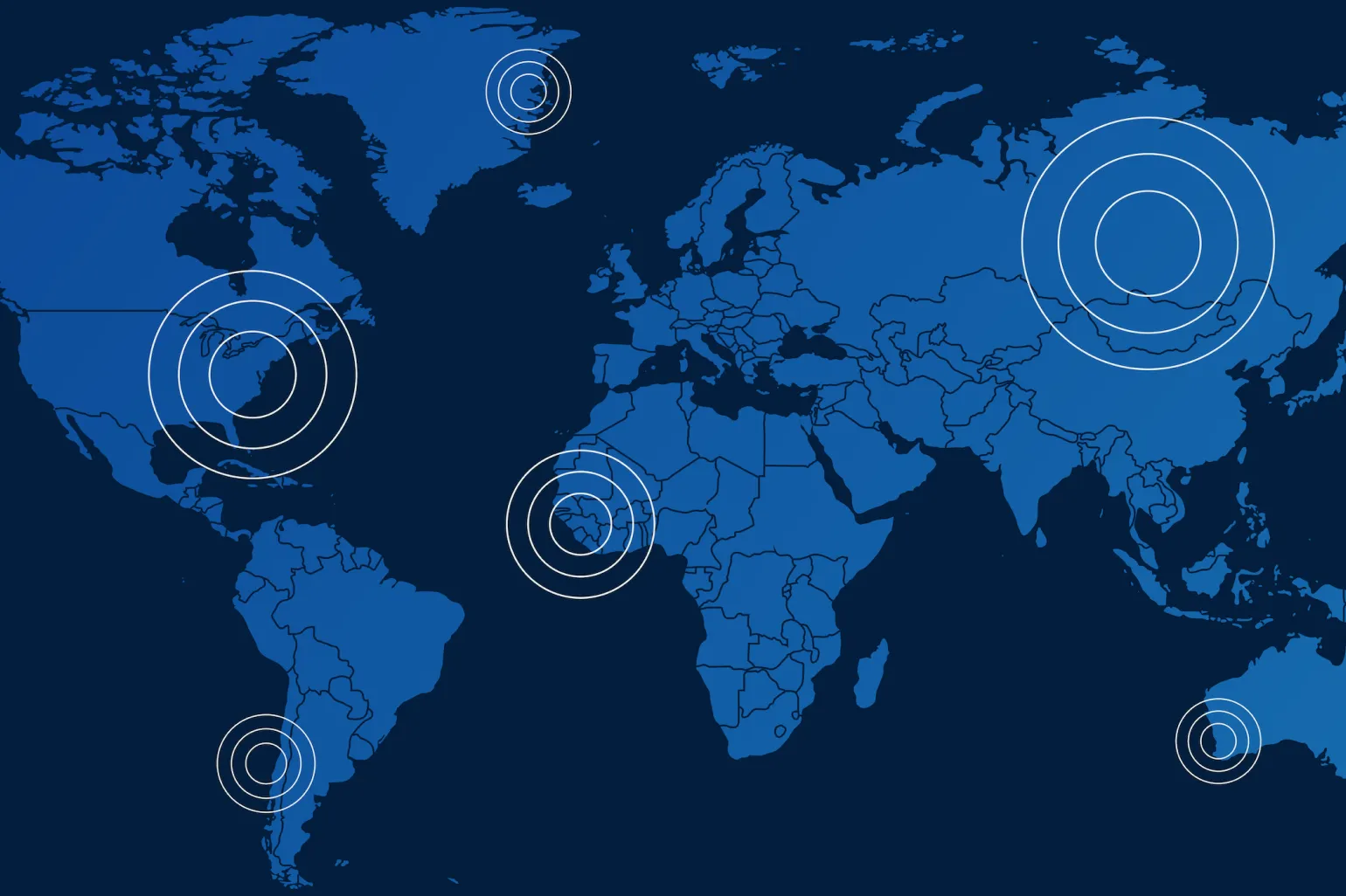
Data can be shown with pins or dots but what do they convey? Are they locations of data or do they pin to a story about the data?
Maps: Storytelling With Data Visualization
We live in an age of information overload. Excessive raw data is overwhelming and only becomes useful when processed into insights. Few can detect patterns among millions of data points, but most can parse bar charts, read maps, and interrupt visualizations.
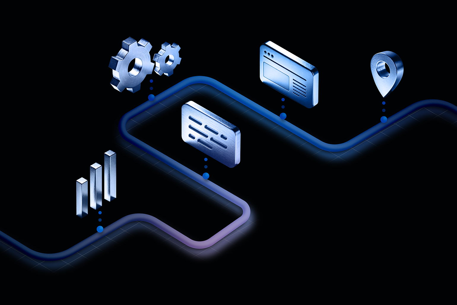
Map visualization, a subsection of data visualization and data storytelling, use information to tell a story. But what makes maps that way and how can data be used to illustrate a particular concept?
Effective map visualization starts with understanding the target audience. Who will use the map? Does the audience have advanced knowledge of the data? Who is generating the map data (a third party or the client)? Is the audience the general public or a specialized group?
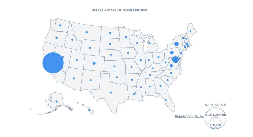
There are technical considerations to consider in terms of updating the data. If the data is constantly pulled from a third-party source then it may update automatically or after a command is executed. Data changes, especially if this is a feature not intended for a one time use. If the data is updated via a content management system, will you have the tools and ease to update the data? Will you simply upload a massive CSV (spreadsheet) file or will you go in and update some points that change? What if you wanted to add new pins to a map and not just sidebar data?
Maps are viewed in a vast number of formats from a desktop browser to a mobile screen. This is where an understanding of design responsiveness comes in handy. Modern websites are responsive to different window sizes. They may look different from a phone than a tablet because of the larger window size and even larger on a desktop computer. Maps pose a unique challenge with responsiveness. As maps scale the distance between cities, states, and nations changes as the map scales.
Another challenge is the difference between touch devices like cell phones and non-touch devices like a laptop. Imagine clicking on a small state, like Rhode Island, on a map of the United States on your phone. One may want to consider a completely different experience on mobile vs desktop because of this limitation. This is where a dropdown menu might be a better experience.
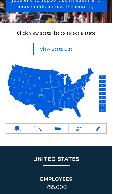
You may consider a completely different experience on mobile vs desktop because of this limitation.
More and more maps are made with scalable vector graphs (SVGs) rather than images. SVGs allow more flexibility, functionality, and an array of specializations in coding than images. With an image, you are unable to change much of it. But with SVGs, you can add and manipulate them beyond imagination. SVGs are part of an entire data visualization library called D3 JavaScript.
Maps can make for some of the most fun projects for a developer to work with. In addition to their unique challenges, maps are increasingly at the center of our collective lives. Each one of us carries a portable map, mapping technology has allowed us to map the entire planet in seconds with accuracy unparalleled to the past. Maps hold for a multitude of specializations. One of my favorite mapping books is An Uncommon Atlas, 50 maps of everything from Twitter relationships to Remoteness from City.
Maps can only tell so much data.
For data to be truly powerful, it must tell a human story.
Ancient fables of journeys didn’t just remark about the places the hero would go, but also tell the story itself. A visualization of the household income in the United States might paint one picture between the state. That visualization is made even more powerful by story pieces connecting the data to real people. The maps and their data are very much a story of people.
Given that, there is no better person than the visualization developer to provide a point of view on what the data means. For visualization to succeed, the data must own the role of storyteller. Since good stories make for good lessons, a good visualization provides the necessary insight for making good future decisions. Consider a map to tell a data story in your next project and let NJI Media help make it for you.