Lisa Kripowicz
07.27.2018
In the battle for “hearts and minds,” science has provided communicators the roadmap needed to engage audiences via data and create content experiences that are memorable and have durable resonance.

Data visualization is playing an increasingly important role in the representation of information. Read almost any news article and you are likely to come across a chart, graph, image, map, or infographic supplying you with supporting knowledge. These analytical-based data visualizations serve a significant purpose: they translate abstract data into concrete, meaningful information that readers can quickly interpret.
HOW IT WORKS
Data visualization is literal eye candy for your brain – which eats up visual information about 60,000 times faster than text (Why We’re More Likely to Remember Content with Images and Videos). To explain this in “simple” neuroscience terminology: light information from a visual stimulus enters the retina in your eye. From there, it travels down the optic nerve and through your brain to your visual cortex, which is responsible for interpreting visual information. This process is known as visual perception, and is one of the strongest ways for information to enter your brain.
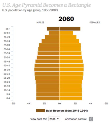
While in the visual cortex, the visual information is translated into patterns. The brain recognizes patterns in images much more easily than patterns in numbers. Take a look at these figures, for example. Which one is easier to spot trends in?
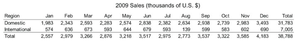
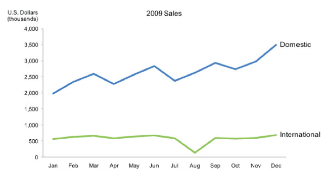
(Images by Interactive Foundation of Design)
WHY IT STICKS
Visual images allow viewers to come to conclusions much more quickly than they would if they were looking at a bunch of numbers. Your brain also gets the opportunity to process information holistically, taking in all aspects of the visualization, instead of focusing on specific numbers or figures that can become distracting.
Visual memory is one of the most accurate forms of memory. Have you ever taken a test and reached a question that you couldn’t remember the answer to, but could visualize the textbook page with the answer on it? That’s your visual memory kicking in to try to help you remember the answer (The Power of Visualization). Smartly designed data visualizations leverage this. Through data visualization, information is more readily learned and recalled.
HERE’S THE PROOF
Nielsen Norman Group research tells us that web users typically read 20% of a web page before losing attention – that 20% they choose to focus on is crucial to drawing in visitors, and having them focus on visual content greatly increases your chances of holding their attention (Why Your Brain Needs Data Visualization). It has also been proven that 65% of people are visual learners, creating even more incentive to convert data and facts into visualizations. As an added fun fact: tweets with images are 94% more likely to be retweeted than those without (Why We’re More Likely to Remember Content with Images and Videos).
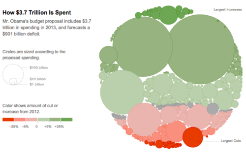
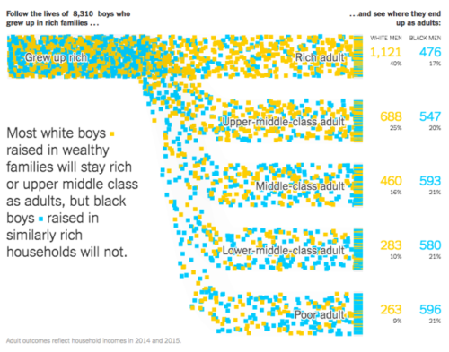
If this blog post wasn’t convincing enough for you, here’s a list of incredible data visualizations to change your mind:
New York Times – Obama’s Federal Budget Proposal
New York Times – Reach of Racism for Black Boys
Pew Research – Next America
Washington Post – The Depth of the Problem